Custom Widgets
Custom Data Widgets
Use custom data widgets to import data from any source via .CSV, Google Sheets, SQL, private URL, or push API.
Visualize data from custom sources
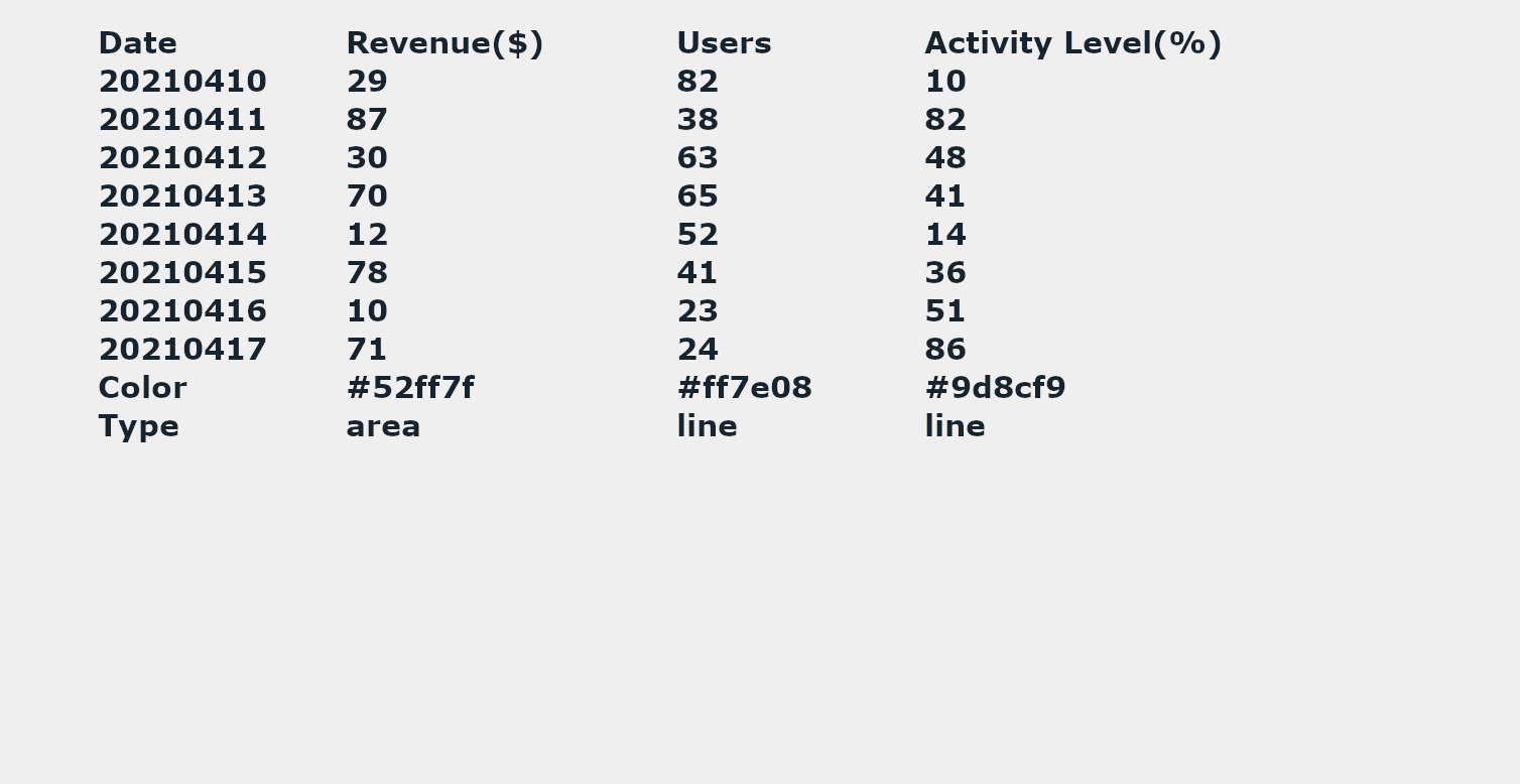
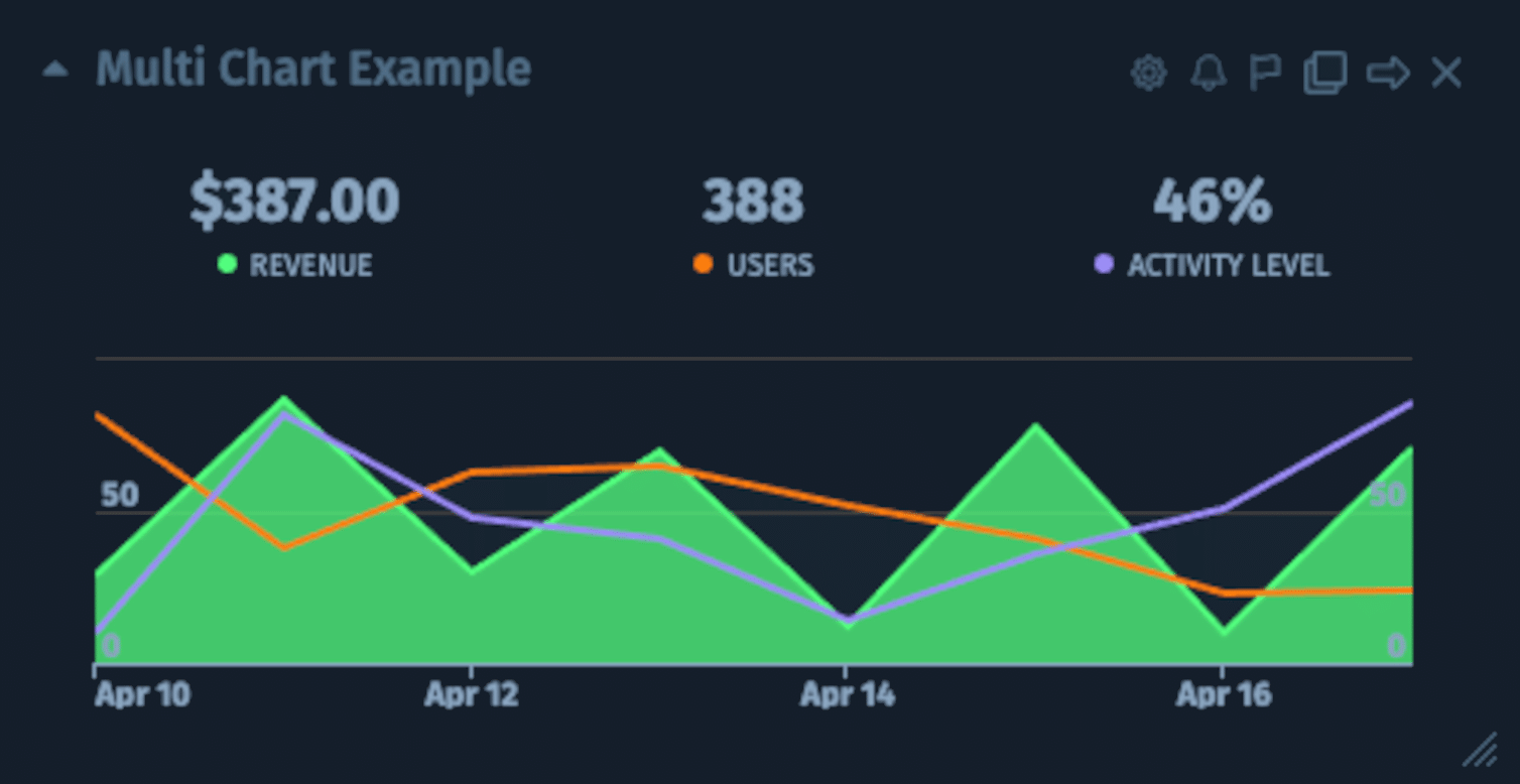
Easily connect a dashboard to your custom data source and turn KPIs into engaging visualizations.


No data left behind
Use our custom widgets library to connect to internal or proprietary data sources that aren’t already covered in our integrations library. If you can export your custom data to Google Sheets, SQL, or CSV or push data to a private URL or push API, you can add it to your dashboard. Cyfe truly creates a space where no data is left behind.
Google Sheets
The Google Sheets widget has a refresh rate of 5 min to keep your dashboard up-to-date.
SQL
For those proficient in MySQL and Postgre SQL, use the SQL widget to query and visualize data.
CSV
Create a data snapshot with the CSV widget. Format your file to display data in multiple chart types.
Private URL
Prefer to point your data to a URL endpoint and choose your refresh rate? Use the Private URL widget.
Push API
Push data from your application to a unique endpoint. The Push API widget is compatible with Zapier.
Chart types take custom data from boring to daring
Turn boring lines of data into eye catching visualizations. Choose from a variety of chart types to display your data. Use a multi-chart, cohort, gantt, funnel, pie/donut, gauge, table, list or number chart type to engage viewers and help your data make sense
Multichart


Each row is a comma separated list of values. You can group as many metrics together as you like into a single widget.
Learn how to create this chart type with:
Cohort
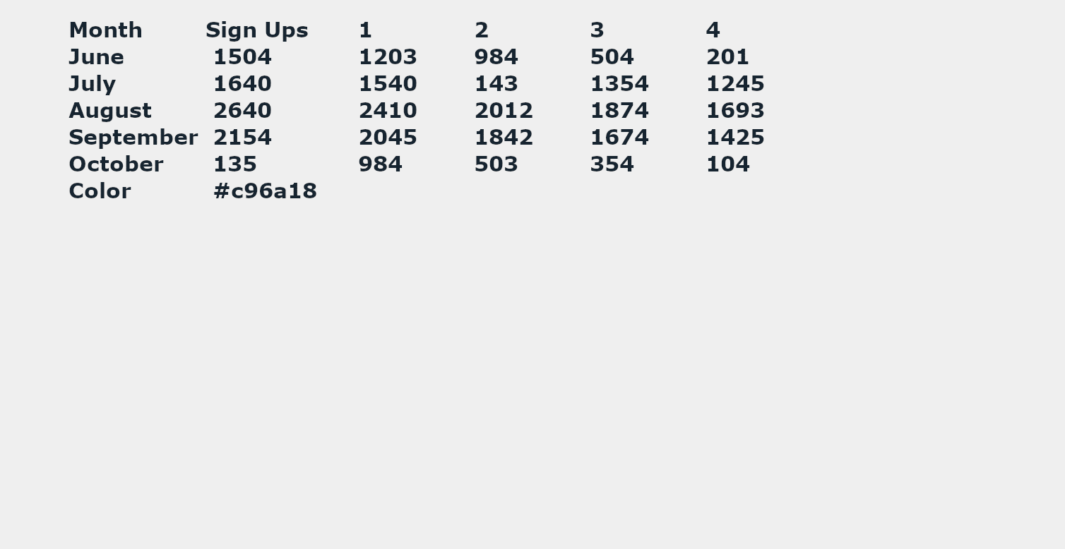
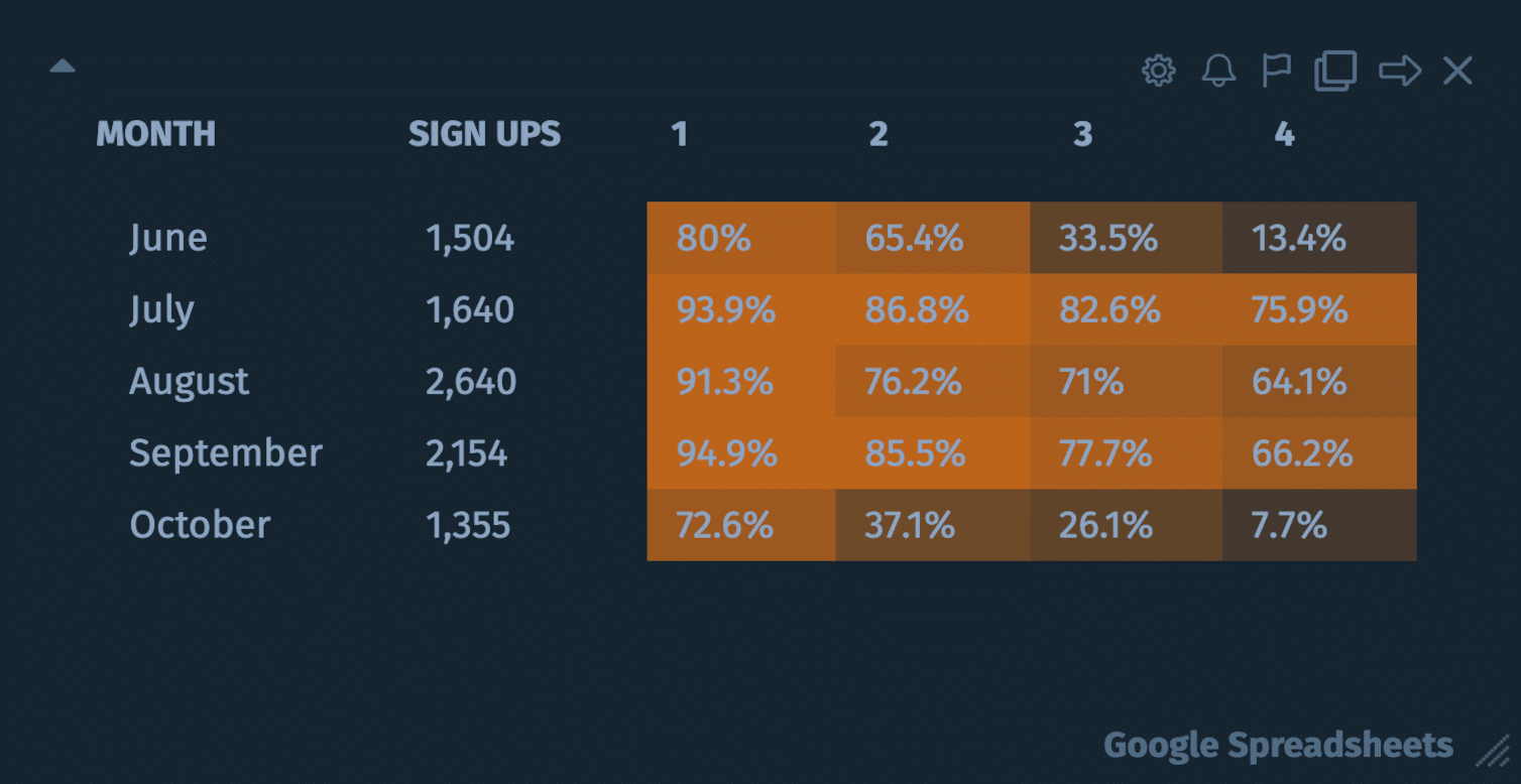
This chart is used to display behaviors of a group of subjects over a time span (e.g. customer retention rates). Each row is a comma separated list of values. You can only display 1 metric in a single widget.
Learn how to create this chart type with:
Gantt
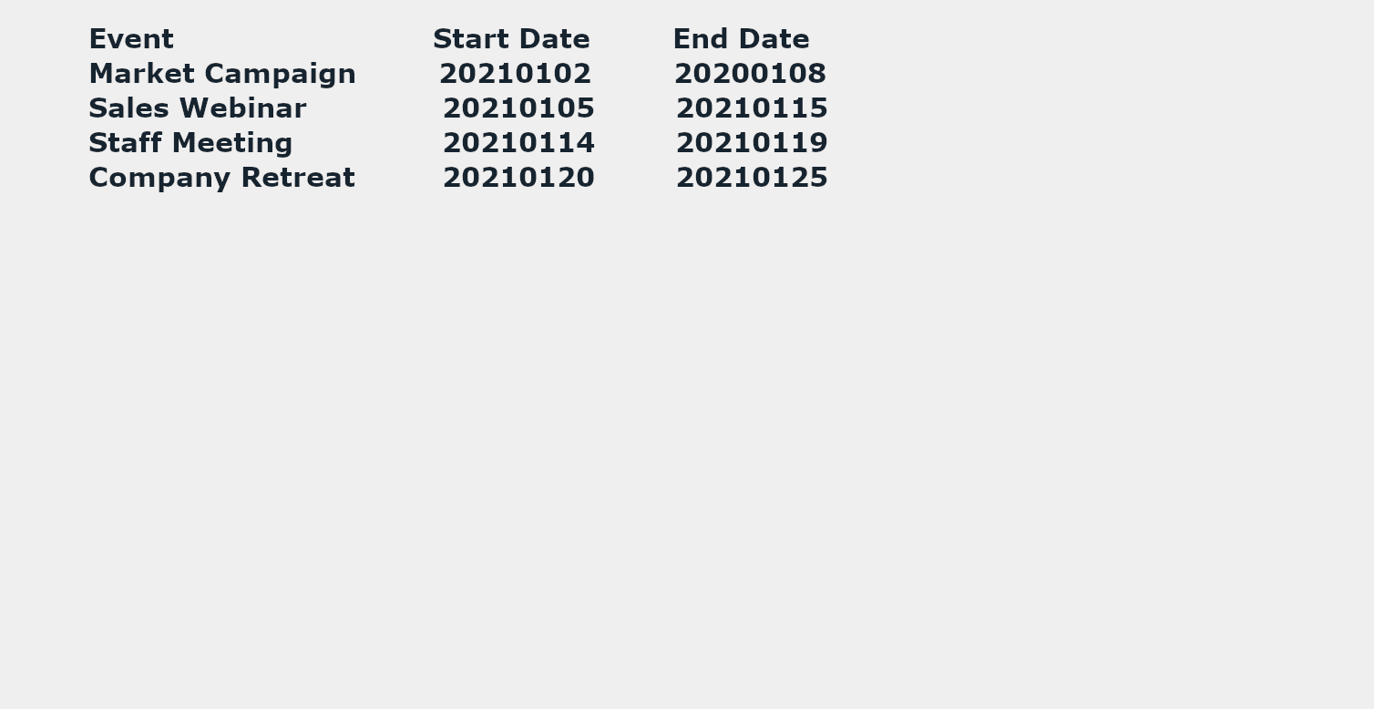
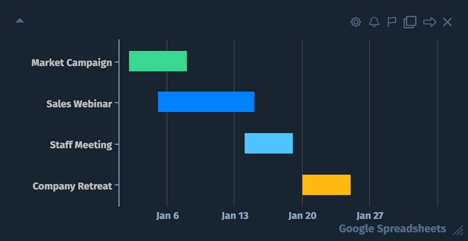
This chart is used to display information as a simple number. Each row is a comma separated list of values. You can group as many metrics together as you like into a single widget.
Learn how to create this chart type with:
Funnel
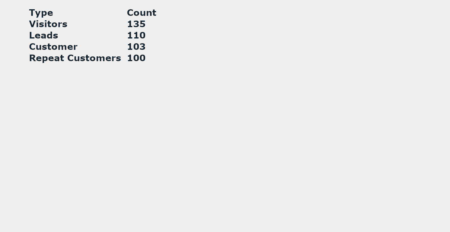
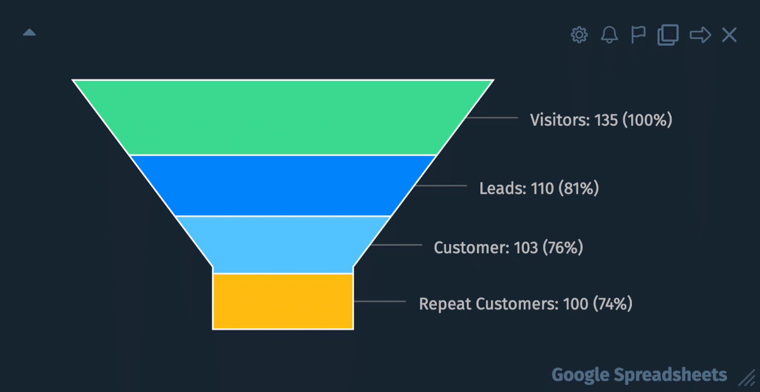
This chart is used to display information in a funnel. Each row is a comma separated list of values. You can only display 1 metric in a single widget.
Learn how to create this chart type with:
Pie / Donut
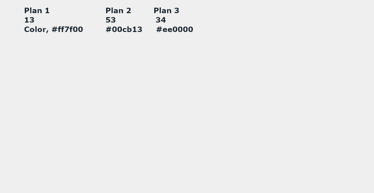
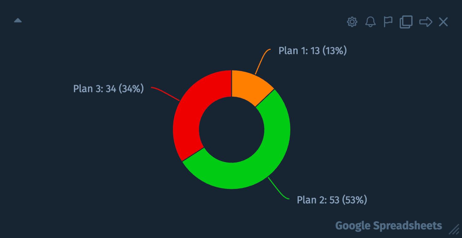
The Donut chart type can be used to show the breakdown of data into its constituents, i.e. parts of a whole. Each row is a comma separated list of values. You can only display 1 metric in a single widget.
Learn how to create this chart type with:
Gauge
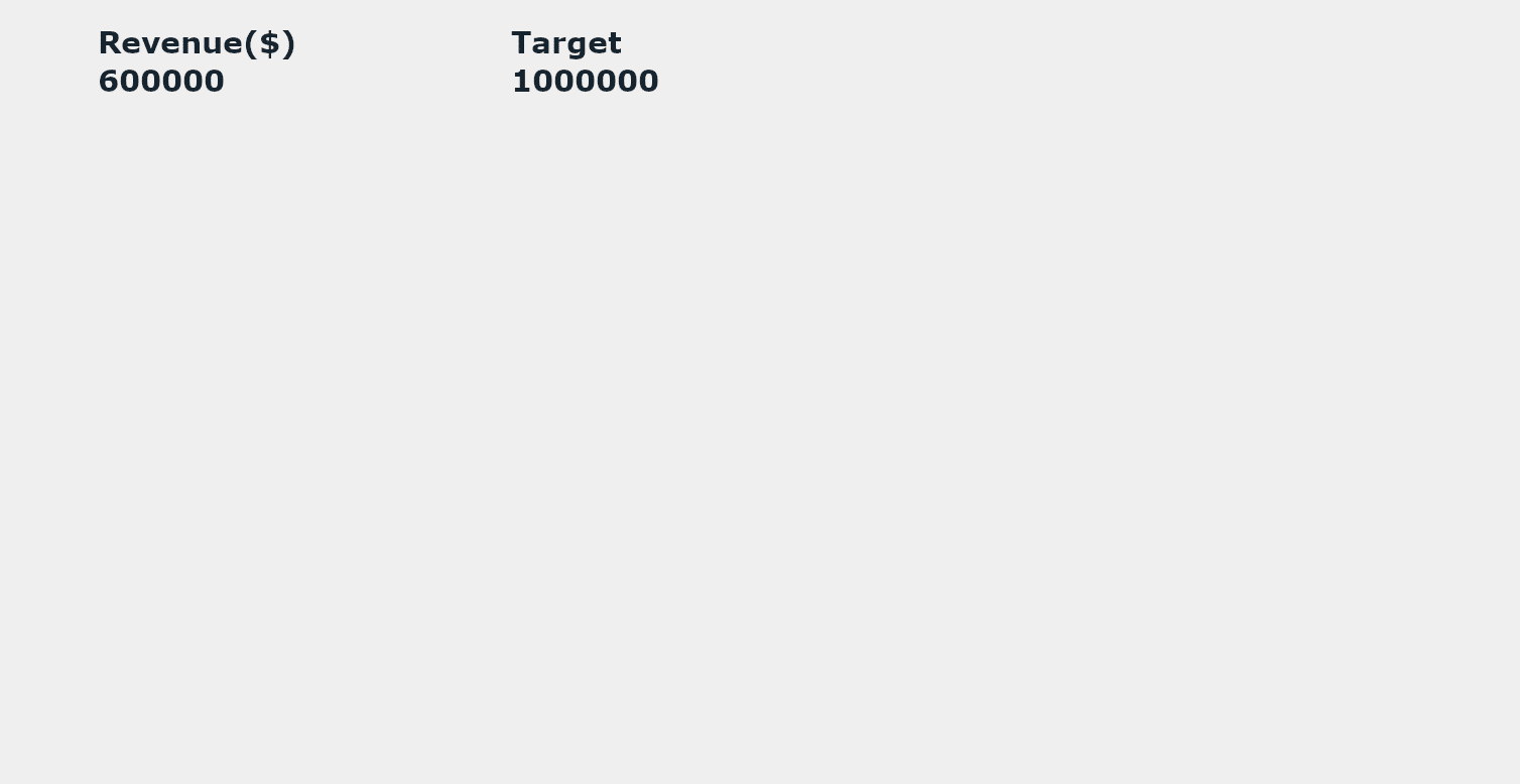
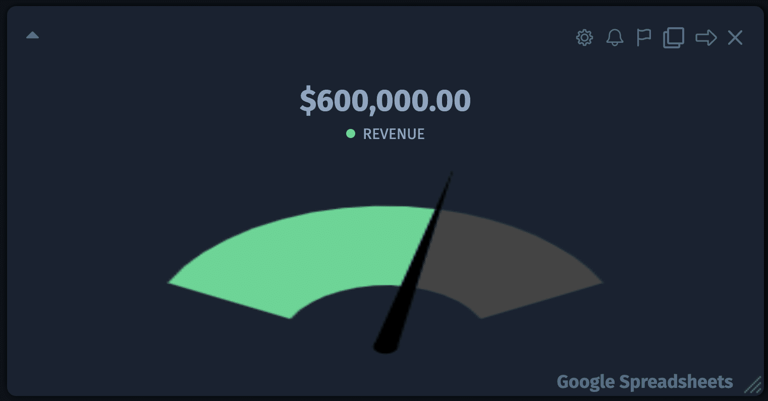
This chart is used to display information in a gauge. Each row is a comma separated list of values. You can only display 1 metric in a single widget.
Learn how to use this chart type with:
Table
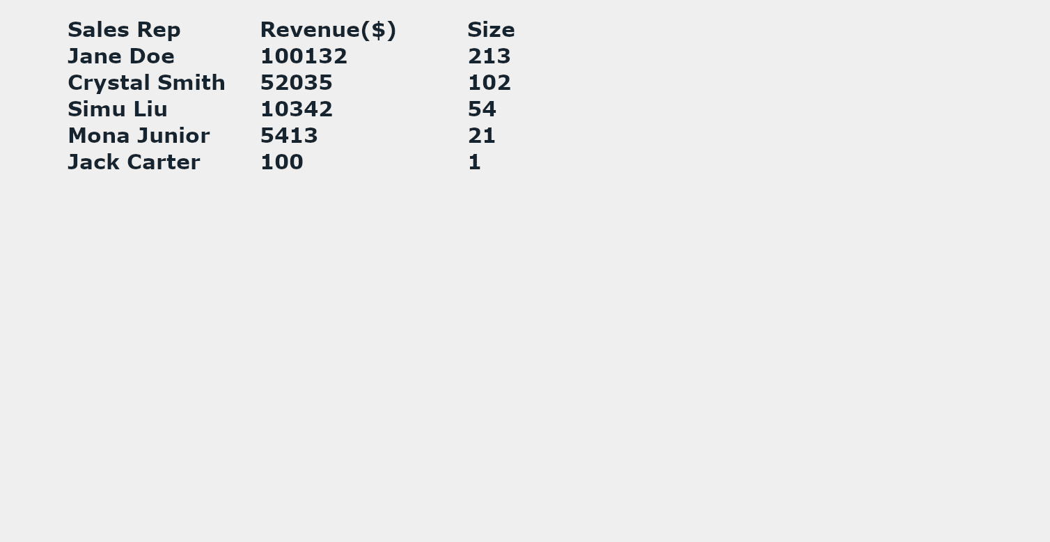
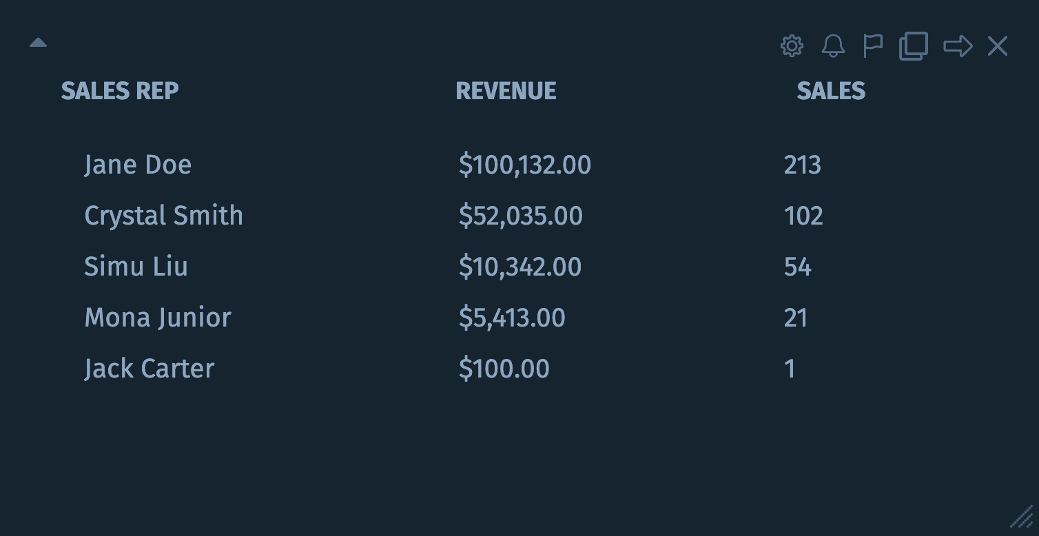
This chart is used to display information in table format. Each row is a comma separated list of values. You can group as many metrics together as you like into a single widget.
Learn how to use this chart type with:
List
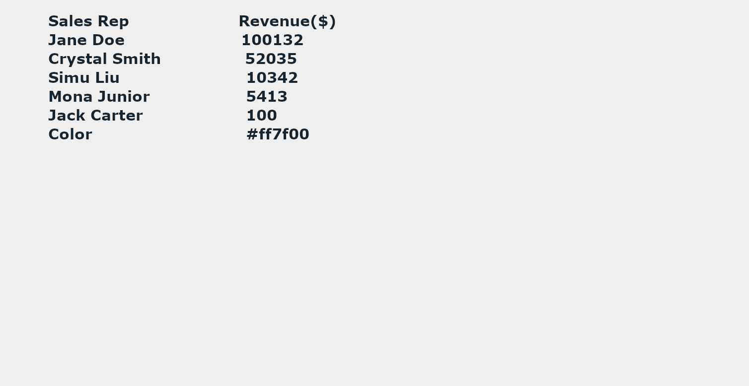
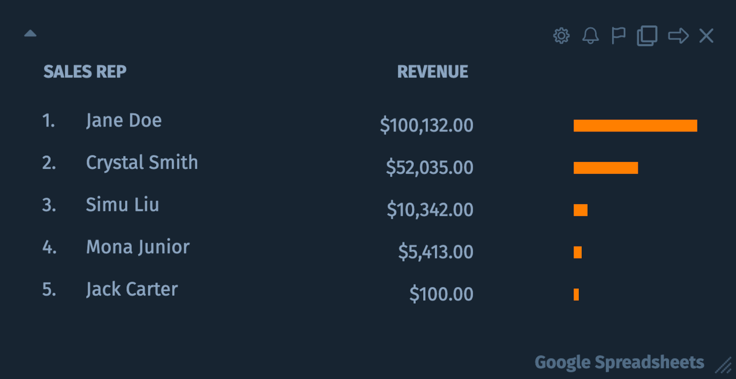
This chart is used to display information in list format. Each row is a comma separated list of values. You can only display 1 metric in a single widget.
Learn how to use this chart type with:
Number
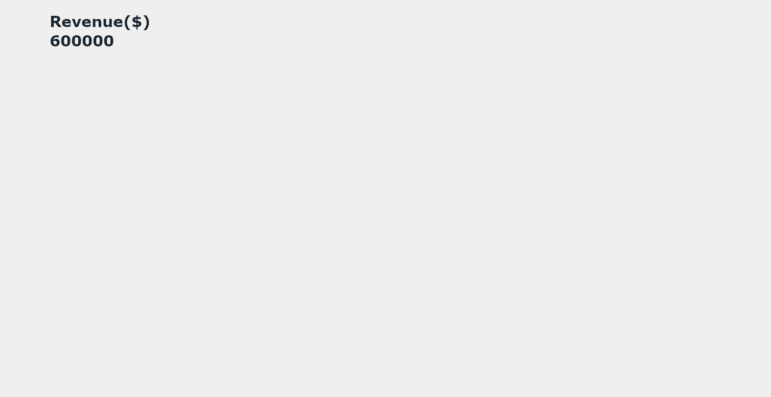

This chart is used to display information as a simple number. Each row is a comma separated list of values. You can group as many metrics together as you like into a single widget.
Learn how to use this chart type with:
Start a 14-day free trial today!